Step Progress Indicator | Flutter package tutorial

Sandro Maglione
Get in touch with meMobile development
12 May 2023[updated]
•8 min read
Sandro Maglione
Mobile development
This is the official flutter step progress indicator package tutorial.
In this article, I am going to explain how to use the package step-progress-indicator for Flutter. You can find the package at those links:
Installation
To import the package in your own flutter project, open the pubspec.yaml file that you find in the root of your project. Then add the dependency to the step progress indicator package as here showed below.
dependencies:
  flutter:
    sdk: flutter
  step_progress_indicator: ^1.0.2
Note that the version of the package may change in the future as new updates are released. Check out the newest version in the official dart repository and the official Github repository.
Usage
Now you are ready to use the package, it was as simple as that! The package provides a Widget called StepProgressIndicator for you to use everywhere in your code.
Let's create a new StatelessWidget and try out some of the features of the step progress indicator package. We create a new file called example_step_progress_inidicator.dart and we write some standard Flutter setup code for a StatelessWidget.
import 'package:flutter/material.dart';
import 'package:step_progress_indicator/step_progress_indicator.dart';

class ExampleStepProgressIndicator extends StatelessWidget {
  @override
  Widget build(BuildContext context) {
    return Scaffold(
      body: Column(
        mainAxisAlignment: MainAxisAlignment.center,
        children: <Widget>[
          // We will place the StepProgressIndicator in a column
        ],
      ),
    );
  }
}
The StepProgressIndicator widget will fill all the available parent width (if the direction is horizontal) or height (if the direction is vertical). Therefore we need to place the Widget inside a parent with a limited size. Indeed, an error will occur if we place a vertical step progress indicator inside an unlimited height Column!
TotalSteps
We will start by adding the StepProgressIndicator inside the Column. The only required parameter is totalSteps. It is an int that defines how many steps the widget will contain.
import 'package:flutter/material.dart';
import 'package:step_progress_indicator/step_progress_indicator.dart';
class ExampleStepProgressIndicator extends StatelessWidget {
@override
Widget build(BuildContext context) {
return Scaffold(
body: Column(
mainAxisAlignment: MainAxisAlignment.center,
children: <Widget>[
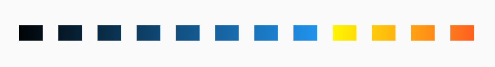
StepProgressIndicator(
totalSteps: 10,
),
],
),
);
}
}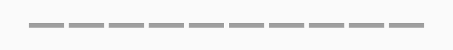 StepProgressIndicator with only totalSteps as attribute
Initial step progress indicator look using only the totalSteps attribute
CurrentStep
When we want to define how many step to select inside the indicator, we can use the currentStep attribute. It is an int which allows us to select a custom amount of steps. Those steps will be highlighted with a different color (see selection colors and custom color).
import 'package:flutter/material.dart';
import 'package:step_progress_indicator/step_progress_indicator.dart';
class ExampleStepProgressIndicator extends StatelessWidget {
@override
Widget build(BuildContext context) {
return Scaffold(
body: Column(
mainAxisAlignment: MainAxisAlignment.center,
children: <Widget>[
StepProgressIndicator(
totalSteps: 10,
currentStep: 7,
),
],
),
);
}
}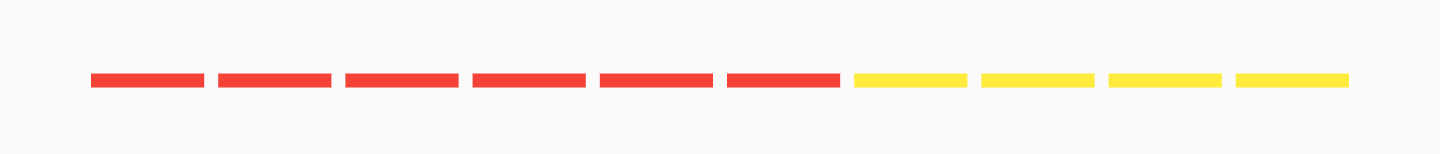 StepProgressIndicator adding the currentStep attribute
Adding the currentStep attribute, now it looks better!
SelectedColor & UnselectedColor
By default, the color of the selected steps is Colors.blue, while the color of the unselected steps is Colors.grey. We can customize those colors by using the selectedColor and unselectedColor attributes.
import 'package:flutter/material.dart';
import 'package:step_progress_indicator/step_progress_indicator.dart';
class ExampleStepProgressIndicator extends StatelessWidget {
@override
Widget build(BuildContext context) {
return Scaffold(
body: Column(
mainAxisAlignment: MainAxisAlignment.center,
children: <Widget>[
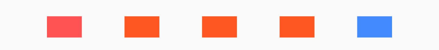
StepProgressIndicator(
totalSteps: 10,
currentStep: 7,
selectedColor: Colors.orange,
unselectedColor: Colors.purple,
),
],
),
);
}
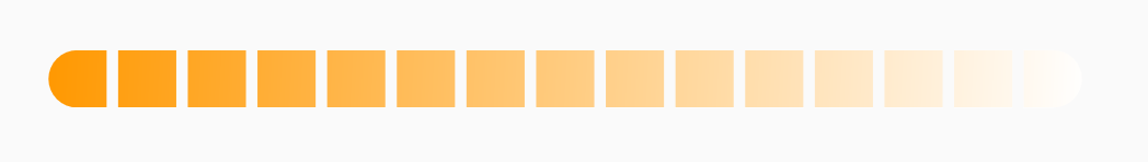
} StepProgressIndicator with custom selected and unselected colors
We can customize the colors as we want
CustomColor
If we want to have more detailed control of the widget's color, we can use the customColor attribute. It accepts a function that takes the step's index and returns a custom Color. In this way, we can customize each step color based on its index!
Note that customColor will override the values of selectedColor and unselectedColor. The attribute currentStep is it now also ignored, therefore it can be removed.
For example, if we want to assign a different color to even and odd steps, we can using customColor:
import 'package:flutter/material.dart';
import 'package:step_progress_indicator/step_progress_indicator.dart';
class ExampleStepProgressIndicator extends StatelessWidget {
@override
Widget build(BuildContext context) {
return Scaffold(
body: Column(
mainAxisAlignment: MainAxisAlignment.center,
children: <Widget>[
StepProgressIndicator(
totalSteps: 10,
customColor: (index) {
if (index % 2 == 0) {
return Colors.green;
} else {
return Colors.black;
}
},
),
],
),
);
}
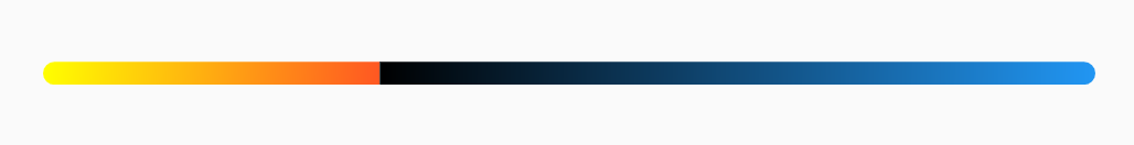
} StepProgressIndicator with custom even and odd colors
Even steps are colored in green, while odd steps are blacks
Spacing
We can customize the size and spacing of the indicator. For that, the package provides the width, height, and padding attributes. The width is only used when we need a vertical indicator, while the height is only for horizontal indicators. The padding allows you to customize the space between each step, not of the padding of the overall indicator (to achieve that just wrap the whole StepProgressIndicator widget in a Padding widget).
import 'package:flutter/material.dart';
import 'package:step_progress_indicator/step_progress_indicator.dart';

class ExampleStepProgressIndicator extends StatelessWidget {
  @override
  Widget build(BuildContext context) {
    return Scaffold(
      body: Column(
        mainAxisAlignment: MainAxisAlignment.center,
        children: <Widget>[
          StepProgressIndicator(
            totalSteps: 10,
            customColor: (index) {
              if (index % 2 == 0) {
                return Colors.green;
              } else {
                return Colors.black;
              }
            },
            height: 36.0,
            padding: 6.0,
          ),
        ],
      ),
    );
  }
}
StepProgressIndicator with custom height and padding
Changing the height and the padding attributes
Direction
We can customize the direction of the indicator steps. If we want the steps to go from right-to-left, we can use the progressDirection attribute, by setting it to TextDirection.rtl.
Furthermore, we can also change the type of indicator from horizontal (default) to vertical using the direction attribute. In order to apply those changes, we come back to the code of the original indicator which uses currentStep and we change the wrapper widget from a Column to a Row.
In the example below, the steps go from bottom-to-top and the orientation of the indicator is vertical. We also added a SafeArea to hide the status bar of the application.
import 'package:flutter/material.dart';
import 'package:step_progress_indicator/step_progress_indicator.dart';

class ExampleStepProgressIndicator extends StatelessWidget {
  @override
  Widget build(BuildContext context) {
    return SafeArea(
      child: Scaffold(
        body: Row(
          mainAxisAlignment: MainAxisAlignment.center,
          children: <Widget>[
            StepProgressIndicator(
              totalSteps: 10,
              currentStep: 6,
              width: 10.0,
              direction: Axis.vertical,
              progressDirection: TextDirection.rtl,
            ),
          ],
        ),
      ),
    );
  }
}
StepProgressIndicator vertical orientation example
The step progress indicator is also vertical!
CustomStep
We are not bounded to have only simple containers as steps. We can customize each individual step widget using the customStep attribute. It takes a function which provides two parameters: the step's index and the step color (defined using selectedColor/unselectedColor or customColor). The function must return a Widget which will be displayed instead of the default step container. In this way, we can customize each individual step with whatever widget we want!
import 'package:flutter/material.dart';
import 'package:step_progress_indicator/step_progress_indicator.dart';

class ExampleStepProgressIndicator extends StatelessWidget {
  @override
  Widget build(BuildContext context) {
    return Scaffold(
      body: Column(
        mainAxisAlignment: MainAxisAlignment.center,
        children: <Widget>[
          StepProgressIndicator(
            totalSteps: 10,
            currentStep: 8,
            selectedColor: Colors.red,
            unselectedColor: Colors.amber,
            customStep: (index, color) {
              if (index == 0 || index == 3 || index == 9) {
                return Icon(
                  Icons.ac_unit,
                  color: color,
                );
              } else if (index == 1 || index == 6) {
                return Icon(
                  Icons.sentiment_satisfied,
                  color: color,
                );
              } else {
                return Icon(
                  Icons.trending_up,
                  color: color,
                );
              }
            },
          ),
        ],
      ),
    );
  }
}
StepProgressIndicator with custom icons as steps
No more boring containers, let's use Icons instead!
OnTap
The StepProgressIndicator widget is also interactive!
You can run a function when one of the steps is clicked using the onTap attribute. It takes a function with the step's index as a parameter and must return another function to perform when a particular step is clicked. You can make your indicator interactive and change its values dynamically after each click (for example to perform some fancy animations).
In the code example below, when a step is clicked a message containing the step's index is displayed in the console.
import 'package:flutter/material.dart';
import 'package:step_progress_indicator/step_progress_indicator.dart';

class ExampleStepProgressIndicator extends StatelessWidget {
  @override
  Widget build(BuildContext context) {
    return Scaffold(
      body: Column(
        mainAxisAlignment: MainAxisAlignment.center,
        children: <Widget>[
          StepProgressIndicator(
            totalSteps: 10,
            currentStep: 8,
            onTap: (index) {
              return () {
                print('$index step pressed');
              };
            },
          ),
        ],
      ),
    );
  }
}
Conclusion
The flutter step progress indicator flutter package has been released recently and I plan to expand its functionality even more in the future. I am open to any suggestions or ideas on how to improve its functionality to make it even better. I am planning to add support for custom animations, let me know what you think.
I really enjoy Flutter and I like to contribute as much as possible to the success and expansion of the framework. If you like the package, leave a like to the pub.dev page so that other people may find it and use it in their projects.
If you enjoyed this tutorial, consider following me on my Twitter and Github, and subscribe to my blog newsletter to stay updated on future tutorials or package upgrades, which I am planning to release in the future. Stay tuned, and thanks for reading.